← Index Case Study 01 / 05
FirenZen
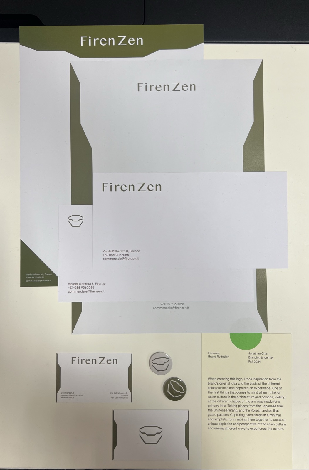
A ground-up rebrand for an Asian-fusion restaurant in Florence. The new mark distils the architecture of the archway: the Japanese torii, the Chinese paifang, the Korean palace gate, into one minimal, stackable symbol, then carries it across everything a guest touches.
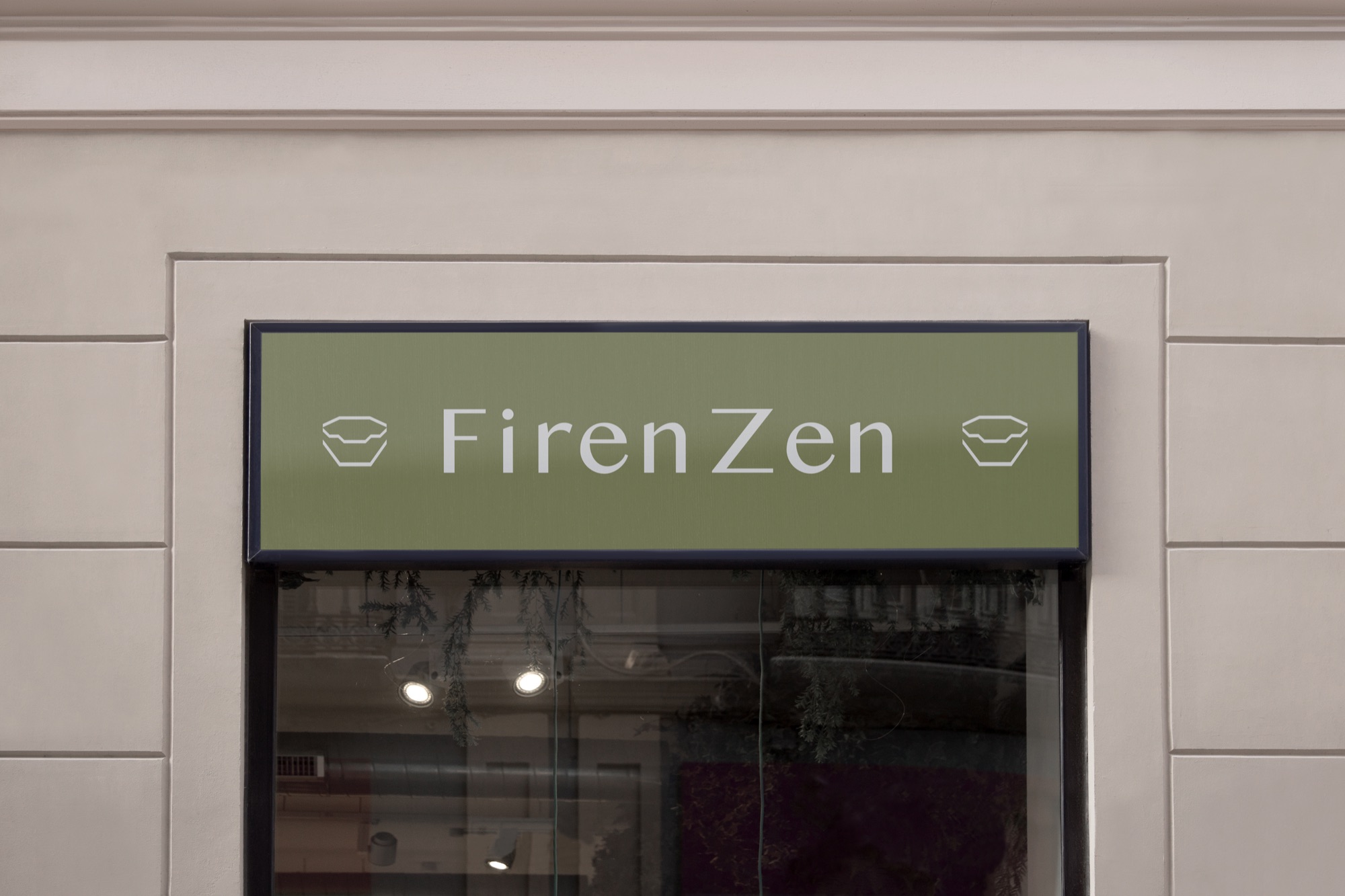
One mark, drawn from three archways.
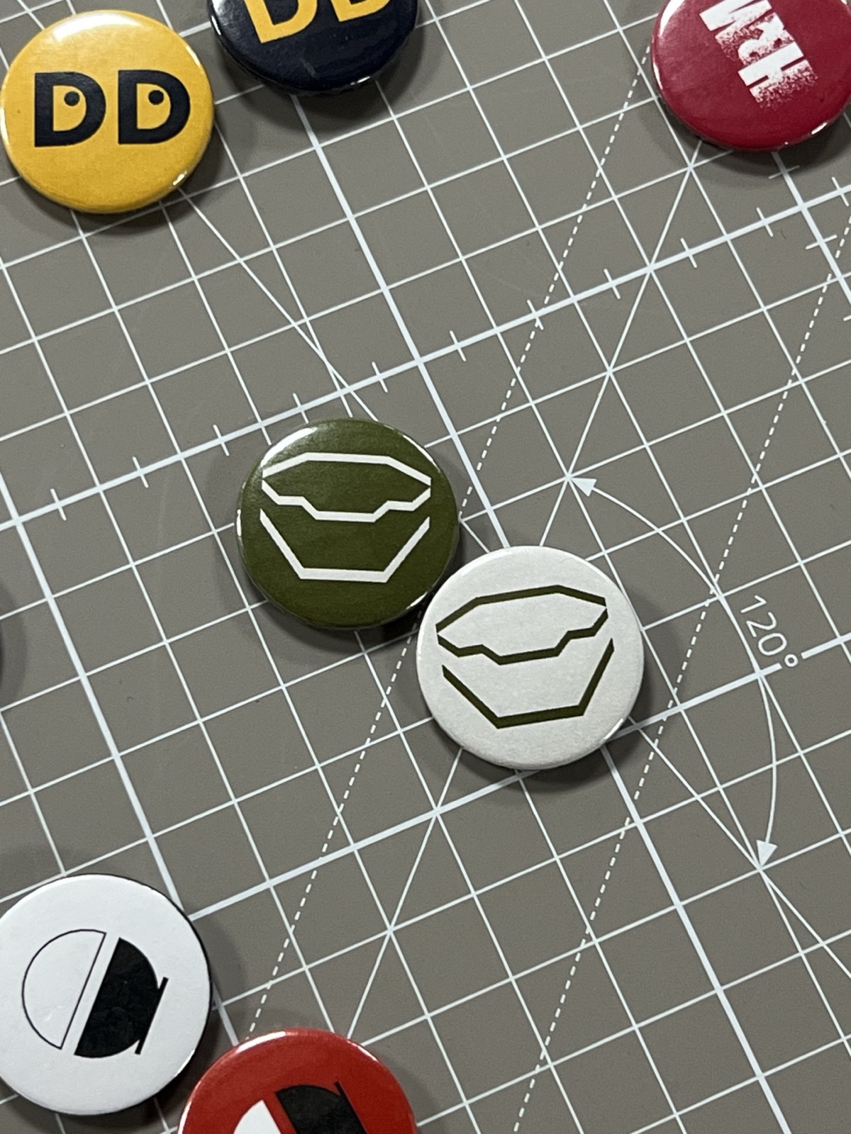
The symbol reads as an opened bento box at arm's length and as an archway up close. It holds at 12 millimetres on a pin and at 2 metres on the fascia, and the whole identity keeps that discipline: one olive, one off-white, one typeface.




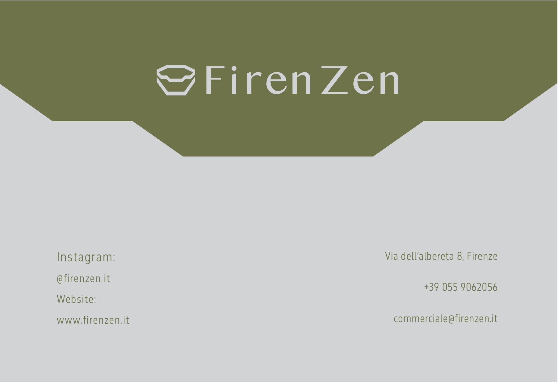


Stationery keeps the arch as a structural device: cropped, mirrored, and bled off the page edges, so every printed piece feels like part of the same building.