← Index Case Study 03 / 05
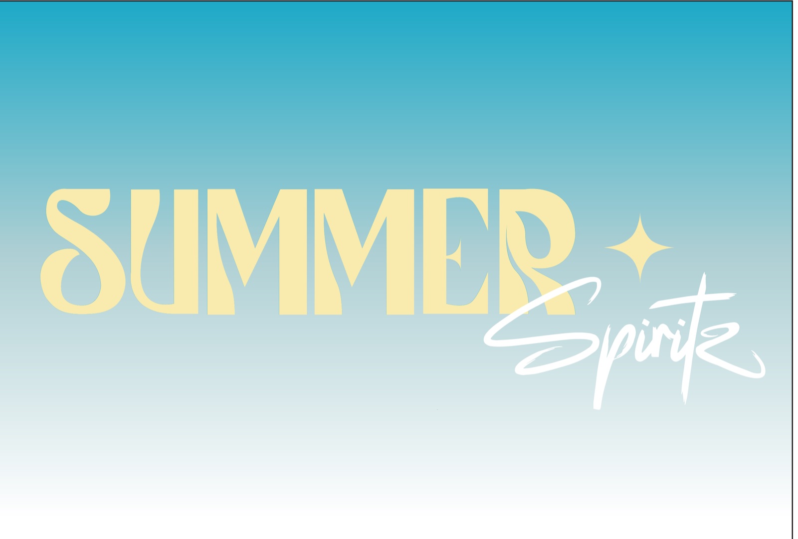
Summer Spiritz
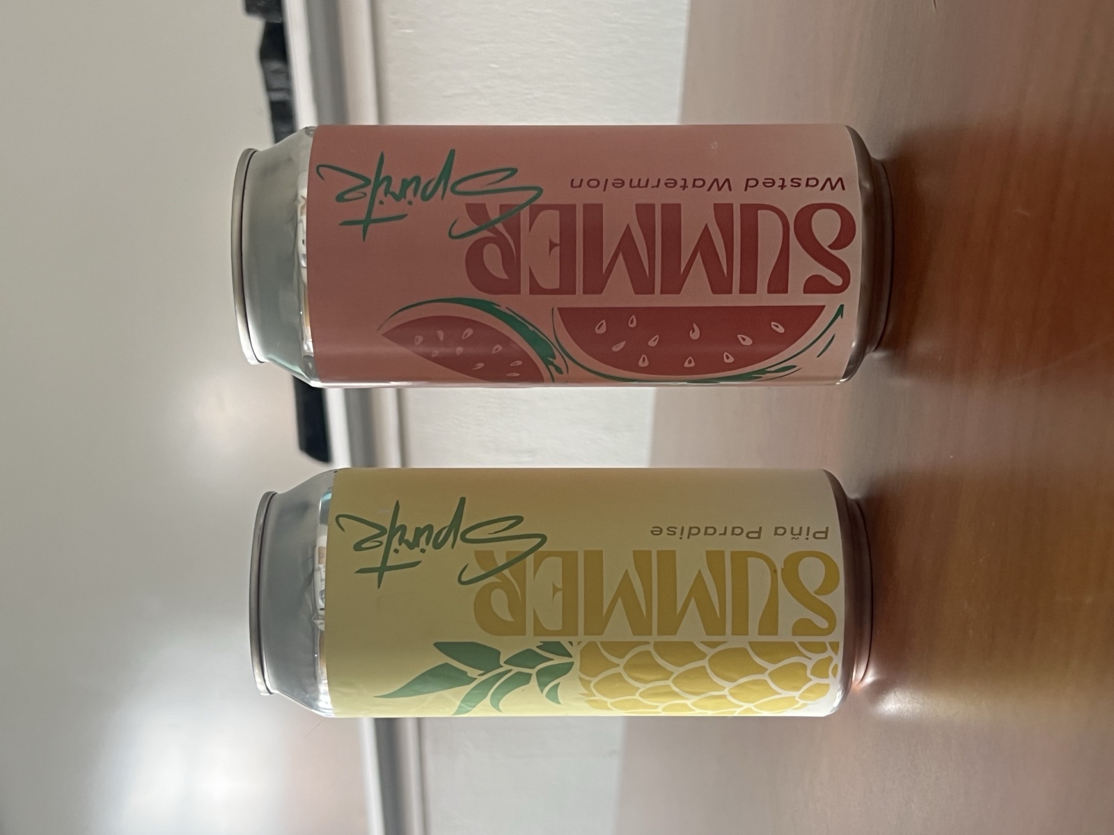
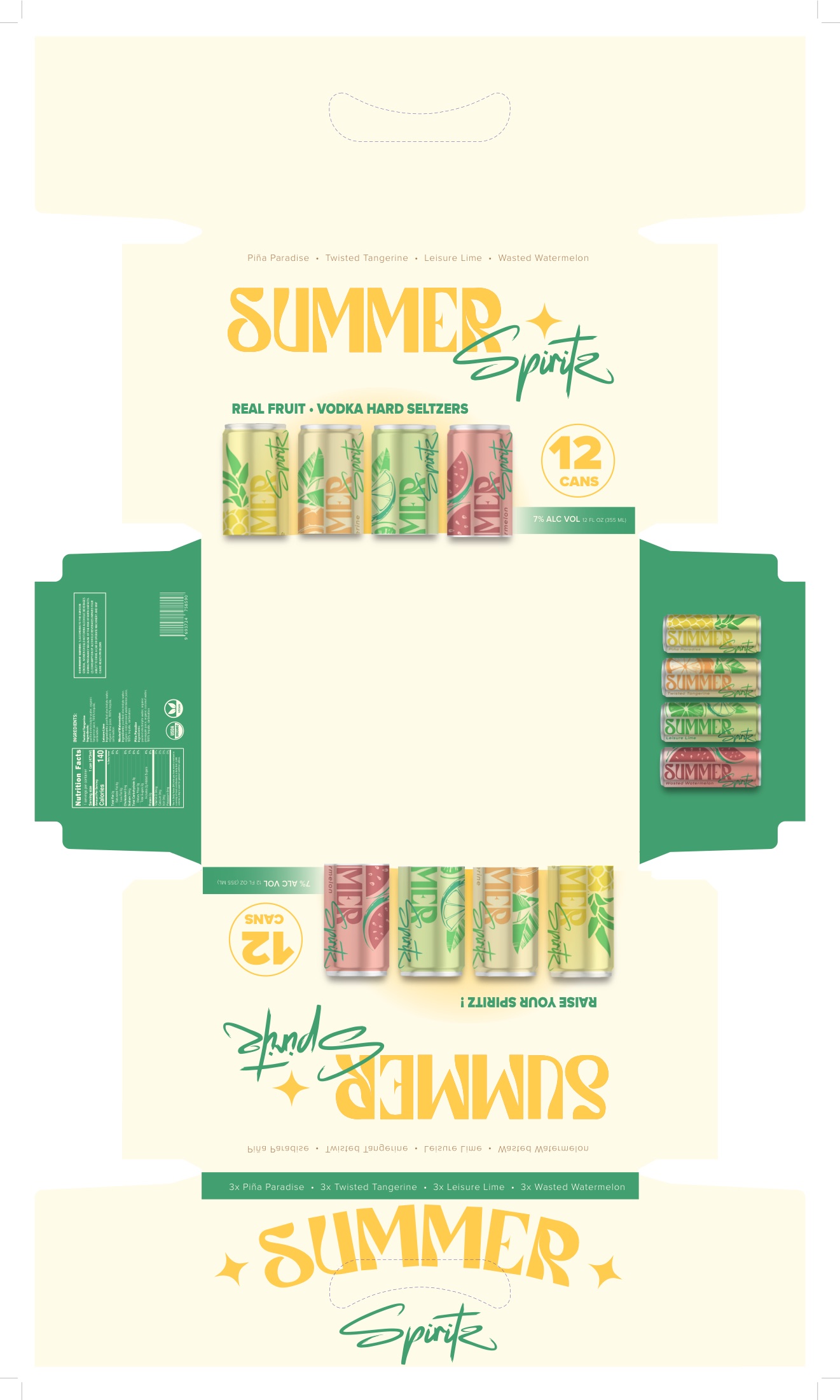
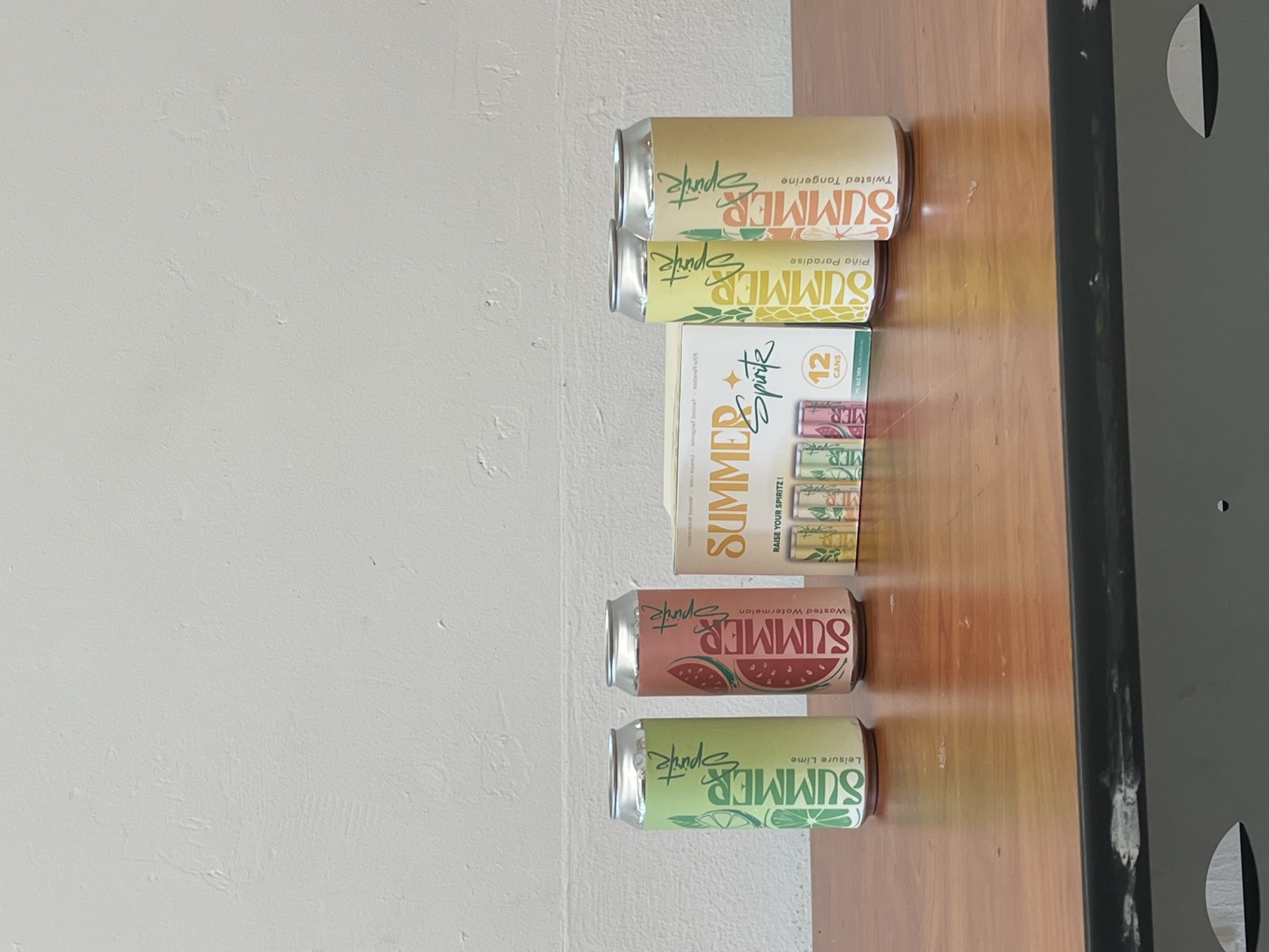
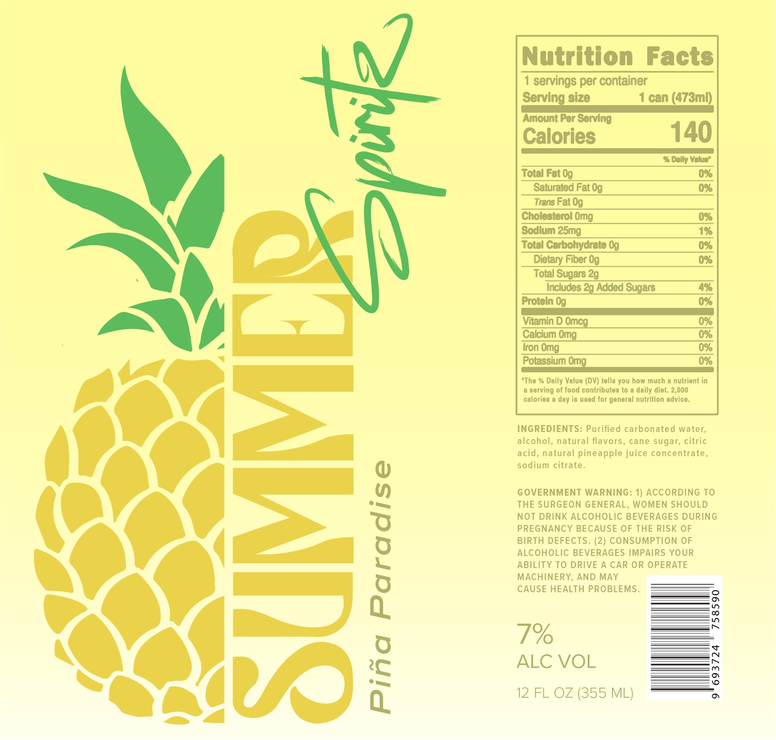
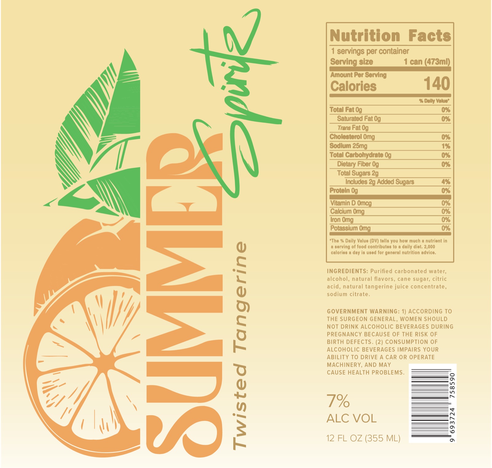
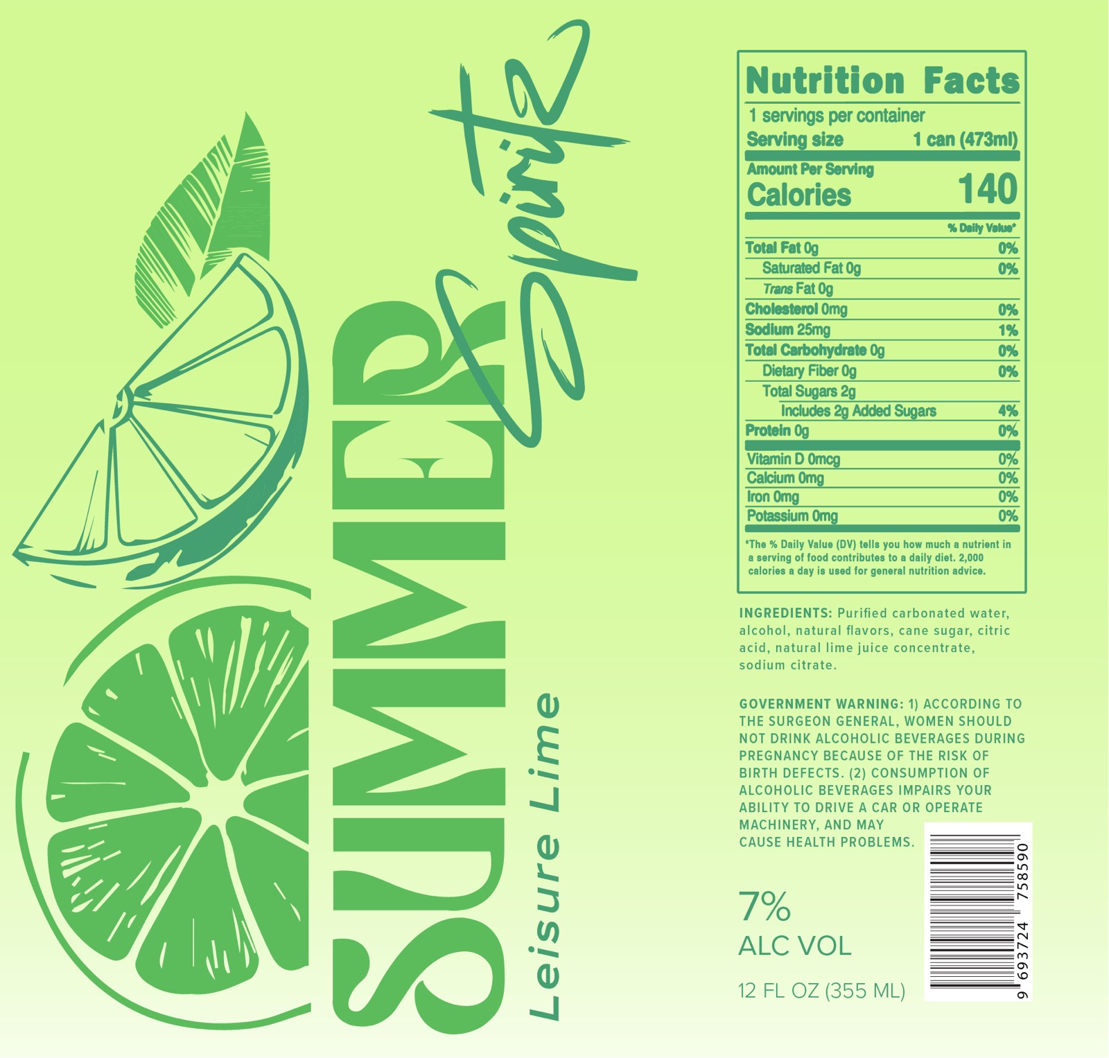
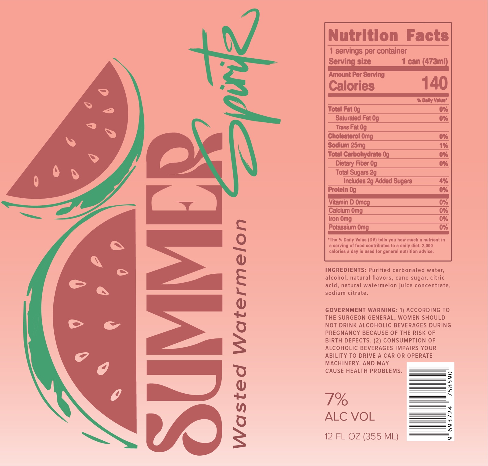
A real-fruit vodka hard seltzer needed to look like the season it was named after. Four flavour liveries share one skeleton: a vertical display wordmark, a hand-scripted “Spiritz,” and a fruit illustration cut in halves, so the twelve-pack reads as a set from across the aisle.
Four flavours, one family.
Piña Paradise, Twisted Tangerine, Leisure Lime, Wasted Watermelon. Same grid, same type, different fruit and temperature, so the system keeps shelf-blocks coherent while every flavour stays legible alone.
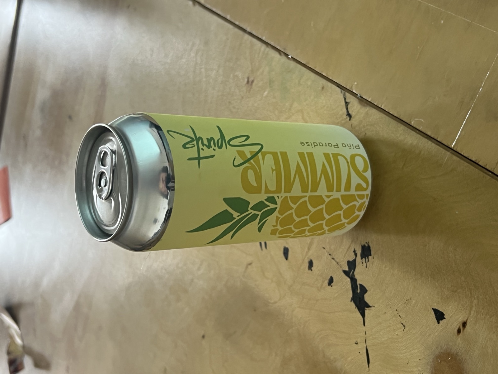
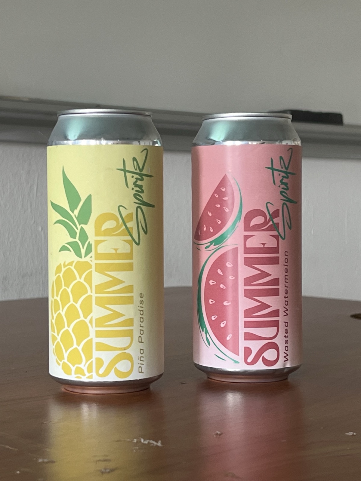
Off the artboard, into hands
Printed & poured